Image by Flickr user “Caveman Chuck” Coker
Maps give us a graphic understanding of the world around us – whether it be global geography or the tricky intersection just around the corner. They help us to grasp concepts of size and distance… but what about IQ scores and vegetation? Or flags?
READ ON: A Map of Happiness Around the World [INFOGRAPHIC]
This creative and varied collection of world maps will open your mind, no matter where you live or how much coffee you've had today.
1. NATIONAL IQ SCORES
This first map shows average national IQ scores – a score derived from standardized tests to assess intelligence. The jury's still out as to why IQ scores vary so much around the world, with theories ranging from environmental factors to genetic influence.
DID YOU KNOW? Singapore boasts the highest national IQ score, with an average of 108.
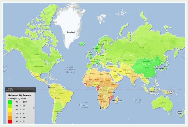
Image: Target Map
2. FLAGS OF THE WORLD
This creative map needs little explanation – just check it out and enjoy!
DID YOU KNOW? Switzerland and the Vatican are the only two countries with square-shaped flags.
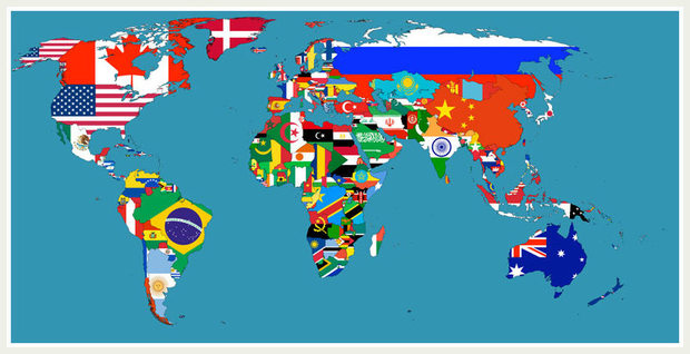
Image: Imgur
3. PAID MATERNITY LEAVE
Parental leave is a hot topic these days, in terms of both length and alternation between mothers and fathers. This map gives a broad sense of global positions.
DID YOU KNOW? The US is one of eight countries (out of 188 with known policies) without paid maternity leave.
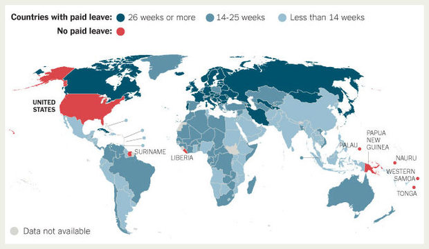
Image: The New York Times
4. VISUALIZING GLOBAL POPULATION DENSITY
While we all vaguely know that Asia is densely populated, this simple map and illustration makes that understanding starkly clear.
DID YOU KNOW? Macau is the world's most densely populated country, closely followed by Monaco.
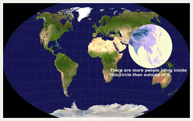
Image: Imgur
5. NATIONAL ATTITUDES TO FOREIGNERS
This surprising and interesting map uses data from the World Economic Forum, to rate how welcoming countries are to foreign visitors. The information was gathered using a survey in which people were simply asked, "How welcome are foreign visitors in your country?"
DID YOU KNOW? According to the data, the three countries in which foreigners are most welcome are Iceland, New Zealand and Morocco.
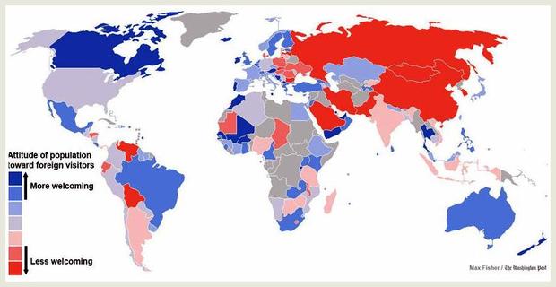
Image: The Washington Post
6. FREEDOM OF THE PRESS
Scandinavia and northern Europe stand out as the frontrunners in this 2013 map, which shows respect for media freedom. We'd certainly like to see some more white on this one in years to come!
DID YOU KNOW? Finland – also known for its awesome baby boxes – has stood out as the country that most respects free press for three years running.
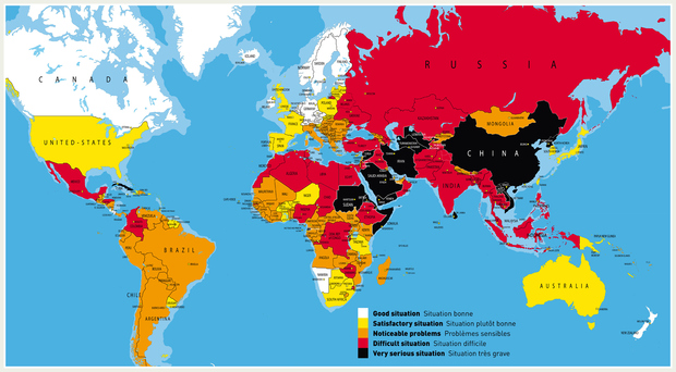
Image: Reporters Without Borders
7. VEGETATION ON EARTH
The dark green on this map indicates areas lushest in vegetation, while the pale colors point to areas which are sparse in vegetation cover - due to snow, drought, rock, or urbanization.
DID YOU KNOW? This incredible map was built using data from the Visible-Infrared Imager/Radiometer Suite instrument on board the NASA/NOAA Suomi NPP satellite.
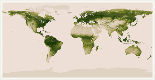
Image: NASA/NOAA
8. ANNUAL COFFEE CONSUMPTION PER CAPITA
This highly caffeinated map shows the amount of coffee consumed annually (in kilograms) by each person in a given country or region. The global trend has been rising upward since the economic downturn of 2007.
DID YOU KNOW? The current world total coffee consumption stands at 1.3kg per person per year. Coffee anyone?
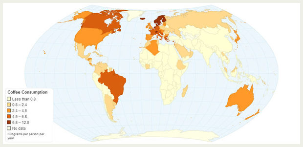
Image: Charts Bin
9. TYPOGRAPHIC TEXT
Last but certainly not least, this artistic creation depicts each of the world's countries using its name, shaped to be geographically correct. Smart AND pretty!
DID YOU KNOW? Like this map the most? You can buy it on our favorite handmade marketplace, Etsy.
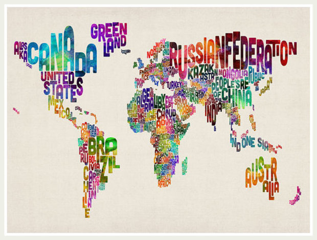
Image: artPause